
Art Basics – Lesson 2. Tints, shades and tones.
So we’ve figured out the basics about the colour wheel, right? Well, partly so. We’ve discussed primary, secondary and tertiary colours in Art Basics – Lesson 1, but the world is made up of a lot more than just those 12 colours. Reports vary, but the general consensus is that the human eye can distinguish over 7 million different colours! We mentioned hues in the first lesson, but artists also talk about tints, shades and tones.
Confused? What exactly is the difference between hue, tint, shade and tone?
Do hue know what a hue is?
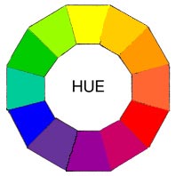
As discussed in Lesson 1, the Hues 😉 are the family of the twelve purest and brightest colours. They consist of:
- The three primary colours (red, yellow, blue)
- The three secondary colours (orange, green, violet/purple)
- The six tertiary colours (yellow-orange, red-orange, red-purple, blue-purple, blue-green & yellow-green)
Together they form the full spectrum of colours which progress around the primary Colour Wheel in gradual increments.
With just these twelve colors, you can literally mix an endless number of colour schemes. Most of the time you will work with these twelve basic hues and modifying them by mixing in other colours, because the world obviously has a lot more than just 12 colours in it! And speaking of modifying; this is where tints, shades and tones come into play! They all modify your hues.
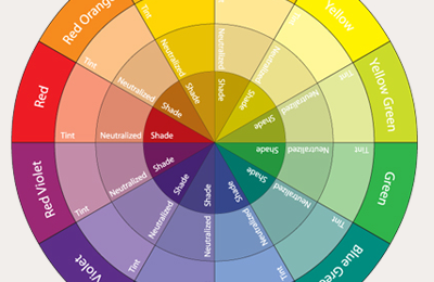
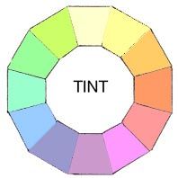
Tints – a whiter shade of pale.
Tints are hues that are made lighter by adding white. So to create a tint of a colour, you simply add white. Tints are also sometimes called pastels. You can add white to any of the 12 colours on the colour wheel and create a tint, or you can go fancier and mix your colours on the colour wheel first, and THEN add white, to even more diverse tints. You can create colours from the palest, lightest blue or yellow (where you’ve added mostly white and very little colour), all the way to a hue (colour) that has barely any white added and is nearly pure.
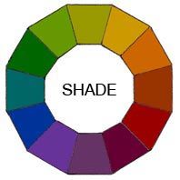
Shades – 50 Shades of…black?
On the opposite side of the spectrum, what happens when you add black in stead of white to a hue (colour)? That’s when you’re talking of shades. Just as with making tints (when you add white), you can mix any of the original twelve pure colours (hues) together or just use them without blending them for more pure colours to start with, and then simply add any amount of black and you have created a shade of the mixture. The more black you add, the darker your shade. If you only add a little bit of black, your hue will be barely shaded.
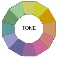
Tones – toning down colours with grey.
So what happens if you add both white and black to a colour (hue)? That’s when you’re toning your hue. Which isn’t like toning your abs; it’s a lot easier! Almost every colour we see in our everyday life, all around us, has been toned with grey to some extend. Adding grey (black and white together) makes for more natural, not as bright and strong colour tones, that tend to be more complex and pleasing to the eye.
So that’s all there is to it! You now know the difference between hues, tints, shades and tones!
Well done, you deserve a cookie. 😉

Now if you’d like to put your new knowledge into practice, click on the link below to some exercises you can try. Experiment and don’t be shy, and enjoy your cookie!
Exercise 1. Colour Wheel Exercises
Good luck! Let me know how you made out and share your experimentations and experiences with me in the comments below, or on my Facebook Page. I’d love to hear from you!
Next lesson: Colour Harmony
This Post Has 0 Comments